


Just going to flat out say it: The art assets in this game are not up to quality
|
Russell, here's my feedback:
I'm pretty happy with the character models, mainly because I don't bother to zoom in. I honestly think the option to zoom in should probably be scrapped in favor of being able to rebind mouse wheel up and down. Being able to zoom in just gives people more ability to scrutinize textures and models and doesn't offer much, really. What I do think should be tweaked are some of the Act 1 rock textures. They seem pretty damn lowres to me, and it stands out when you have these great shadows and sand textures everywhere. I'd also like to see reeds respond to character movement, and splashes in water when you walk through it. I think that'd add a lot to the game's polish. I know a long time ago I saw you say that that is something you hope can be added, but I'm reiterating that I think that would be a good polish-related feature to have before full release when the game is open to the scrutiny of reviewers. |

|
|
Ok you guys guilted me into doing a paintover, I'm calling this "Paintover of Exile". If i'm going to come into a forum and talk a lot of crap, I should rightly back it up with specific examples of what could be done better as many of you have stated. Sorry for being a bit of an ass about all this.
To be fair, it's a lot easier to get moody elements done in a paintover than in 3d, 3d elements such as alpha cards and vertex light baking can be done to do the same thing but are a bit harder. Anyway, here's a paint over that addresses I think *most* of my main concerns with the art in this game: Original:  Paintover  Paintover (captioned):  As for environments the main issue is if you ever look at the screen it's just flat. The walls and the floor all have about the same spec values, the same tonal ranges, and there aren't specific environment assets that help break up their transitions so you're left with lots of hard polygonal creases at the base of rocks, pillars etc. There aren't touches of one color here, another here, or depth in color. It's a bit "noisy". As for characters, I feel they have a bit too much of a "blank stare", more could be done to find a facial expression that isn't out of place in a permanent state. Also many of them have generic proportions and look a tad "sickly", not rough and tumble like game characters. Also say what you want about space marines, but having big meaty armor pieces gives you a large palette to show off the details in normal maps, spec, etc. When all armor is of a generic and believable size, you don't have room to make your armor look cool!  I wont be long winded with this, this is undying from Dota 2, just look at how awesome he is and draw inspiration from it! Notice how well his armor fits and helps keep his form without being generic clunky parts just thrown on. It is vital that armor fit or exemplify form without being just tacked on. Quick edit: I've been really negative throughout this whole thread, I just wanted to state that there are flashes of brilliance in the art as well, it's not all bad, some of the environments (particularly indoors) really shine, love everything about the UI, effects are great, and the shadowing is some of the best I've ever seen. There just seem to be as universal art issues throughout the 3d space. Last edit for reference:  Last edited by crazyfingers619#3901 on Feb 15, 2013, 11:45:21 PM
|

|
|
Thanks for the images man. Ill get back to this post tonight.
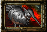
Hmmm How can you post undying when theres lone druid in the game  I like all the fluffy animals[img]http://i.imgur.com/mO8dR.png[\img]
y im slept? |

|
|
Your examples in that paintover look frikking horrendous, are you insane?
|
|
|
Yeah, the paintover is fucking horrible. What the actual fuck. It's objectively shit. Honestly, if PoE looked even similar to that, I wouldn't touch it. Jesus Christ what's wrong with you?
The one valid point you bring is the boring armors. |
|
|
Your paintovers look like Torchlight. I hate the art of Torchlight.
I don't play Torchlight or LOL because of their childish, cartoony art styles. POE would not appeal to me if they looked like Power Puff cartoons. I sincerely hope POE does not take your advice. I don't even mind the Armor....it fits the theme of the game, being an exile on a nightmarish island. wearing scraps of armor from undead minions and what you find lying around. Plus it leaves room to grow in future acts. WOW started to look like crap because they ran out of cool art, and had to start doing ridculous themed armor....it looked horrible. Last edited by Litheum#7285 on Feb 16, 2013, 2:43:32 AM
|

|
|
Holy bucket <curse word> guys, calm down.
It's a paint over with flat colors, It's not necessarily a final product. I hope you see where he's going with this, simple things like distinguishing between the ground and the rock with more apparent colors is actually a legitimately good and idea and perfectly reasonable criticism. He did flat color paint overs, so it's going to be flat colors. Like certain cell shaded games that inspire such vitriol. Chill out, please, you're making the community look bad. edit: I'd like to strongly say I agree with this: " The blank stare actually BOTHERS me, and I mentioned it earlier. I'd love for the duelist to have a smirk, or the marauder a snarl. edit 2: Hey Crazyfingers, could you post a side by side of your last edit? I'm not actually seeing what you edited. Last edited by Talfrey#1490 on Feb 16, 2013, 3:52:52 AM
|

|
" You think you can make a better looking game? I am tired of all the amatuers complaining. This is the best looking ARPG I have seen and I have seen and played them all. The only game that may compete is Grim Dawn which should be in alpha later this year. Also your PC must be crap because my screens look gorgeous compared to the ones you posted. Last edited by jpnole#6782 on Feb 16, 2013, 4:09:29 AM
|
|
" Wow. That pic is amazing. Do you do commissions? Seriously, though, I appreciate OP's effort to bring forth constructive criticism when asked. For the record DotA 2 is probably the most gorgeous top-down game to appear for a long while. They've also done a stellar job of making everything clear, crisp and coherent, which is SO important for a game where control during massive teamfights is so crucial (also spectating!). I think GGG could draw a lot of good ideas from the way that game is graphically put together, and I'm sure they have. PoE is a beautiful game, I think. My artistic tastes are weird and varied though and I'm not actually too fussed overall. I do agree with the sentiment that the main characters have a sort of "dead" look going on. I love that the marauder looks like he's been in twenty too many punch-ups, and the witch who seems pale, creepy and in need of more sunlight. They just need...expressions? To compliment the character they're given by their voiceactors. Last edited by OverUsedChewToy#0953 on Feb 16, 2013, 4:48:30 AM
|
|
" Please draw a sweaty pair of glistening, beautiful templar thighs. I'm willing to pay up to $200 AUD. |

|


 ...
...


