


Just going to flat out say it: The art assets in this game are not up to quality
|
Would not it be better lock and forget about this topic? It does not appear that the initiator of the conversation has nothing useful or constructive to say. Even their arguments are weak and exemplifications childish . I do not think he feels and understands the game. Played? of course! but that was all.
Nice day everyone. |
|
|
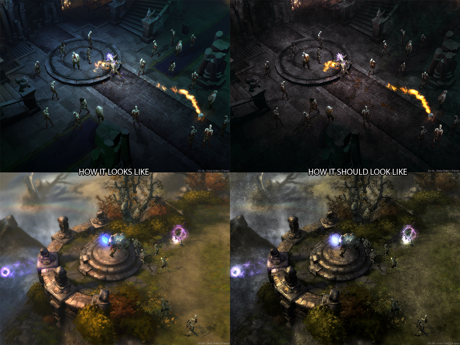
A better comparison would be with the art of the "What Diablo 3 should have been" controversy.
http://www.diablowiki.net/images/b/b4/Art_controversy_01.jpg http://www.diablowiki.net/images/7/77/Art_controversy_02.jpg http://www.diablowiki.net/images/9/9d/Art_controversy_03.jpg http://www.diablowiki.net/images/2/2c/Art_controversy_06.jpg http://www.diablowiki.net/images/1/18/Art_controversy_07.jpg http://www.diablowiki.net/images/b/bf/Art_controversy_08.jpg Realistic, gothic and very atmospheric. |
|
" Problem with artist is they have a drive to create but little to no concept of time and money and self worth. " This example is very problematic. The full drawing of the horse "7 year old style" is better while it is a poorly drawn horse its easier to identify as a horse. If you took both images and rotated them 180 degrees you would identify the poorly drawn one faster than the nicely rendered drawing if you have no previous knowledge of the correct image. If the goal of the art is to get the idea across to its viewers. Its usually best to remove visual clutter and reduce it to a simplest form. This is why we can still identify animals in "cave man drawing". Take for example a school zone crossing sign. While its a simple generic silhouette its quality. It could be a full color 1200 dpi photo of a kid crossing but that wouldn't be as easy to processing in a short amount of time. "Environment art textures are noisy and lacks compelling color palettes." I disagree with lacking compelling color palettes. I could say, that the example screen shot of diablo3 Lacks detail and definition. Its to painterly. the leaves are not distinguishable from each other and the color pallet lacks compelling colors, its a yellow brown red mash of muted tones. Path of Exile was build game play first graphic second. Its logical that the art would suffer a little. "I'm the unreasonable one here".. short answer is yes. The solution to your issue is money. If you have an issue with the graphics buy a bunch of pets or skins.. a ton worth... Unlike Blizzard who could strip down D3 salvage the graphics and rebuild the game play a few times GGG's pockets only run so deep. But comparing GGG to Blizzard is hugely unfair but speaks volumes about quality small staff that GGG has employed. Last edited by Eggo#7137 on Feb 15, 2013, 2:25:01 PM
| |
" I dunno I have some pretty good contenders for that.
Spoiler

Spoiler

Spoiler

Spoiler
 Just some of the really pretty and artistically brilliant games I have played in the past. |
|
|
i dont want to play a fucking WoW cartoon type RPG
I carve and sell real animal skulls, check out my work here: https://www.instagram.com/victorseiche/
https://www.facebook.com/victorseicheart/ World first Uber Atziri as 2h and 2h RT build: https://www.pathofexile.com/forum/view-thread/1058950 Highest level char in Closed Beta, Wytchfindergeneral |
|
|
Hmm so red through all of this thread and havnt found any real useful feedback. A few random things are pointed out but not in a specific direction. Telling us textures are bad and blurry you guys suck isn't really super helpful. Also pointing out where you feel colour pallets clash and so on would be useful.
As some examples Textures of the fences in the lunaris temple look low res and grainy as hell and a lot of the torture equipment is way to shiny and low res. Also the blood placed around on the ground in this area looks like plastic. This looks is caused from the blood decals having too flat normal maps and spec compared to the rest of the area. Also all the gold ornaments stuff on the walls looks low res and way to shiny. Why is there yellow and red frogs in the sewer environment when everything else is blue and green? Why do the duelist and templar look so much lower res than the other characters Why are there way to many tree shadows in forest areas creating screens upon screens of shade. Also while your in the shade why is the player light green? It gives everything this really weird gold tint that juts of from everything else in the area. Thats useful feedback ^ ... and also my feels. We do have quite a few areas in the game that work though. Act 1 town , The light outside areas in act 3 and our indoor churchy areas (they just need some extra doodads to bring out more reds and so on). Oh the uphill side of the crossroads works too. I feel the old fields broken bridge and crossroads are all pretty blank now. Oh right keep in mind we have 1 guy doing textures (well I do my own textures for fx) xD. I wonder how many blizzard has. However yes I feel we have some weird incosistances of art style all over the place. If you have some feedback on FX id also like to hear it. As long as its not OMG PLZ FIX LAG or... OMG CANT SEE IN GROUPS or.. OMG EFFECTS TO BRIGHT (again referring to groups). These are already known as hell issues and iv answered them many many many many many many times : ) I like all the fluffy animals[img]http://i.imgur.com/mO8dR.png[\img]
y im slept? |
|
" How about you show us something that is better, show use other games that did it better and point out the direct difference. Just using buzzwords like "not pleasing to the eye" isn't really helping your argument. Art is subjective if you like it or not doesn't mean anything. To point out flaws is okay but then please with concrete examples. I think GGG has a lot of amazing art, maybe not in 3D but the 2D aspect is really cool and something that I don't see in many other games. For example the new Skillgems are really creative and cool looking. I also like the Itemicons in your inventory. I loved those in D2 as well. Well my last comment would be, if you are yourself some sort of artist show us how you would have done it better. I'm a mediadesigner (not a good one though) and I think they are pretty good. |
|
|
Personally, I prefer that GGG focuses on gameplay mechanics and content before worrying about the resolution of some random-ass texture on some random-ass detail in the corner of some random-ass sub-area. People seem to forget that there is a very real physical constraint when you have one texture guy taking care of the texture of what is probably at least tens of thousands of objects.
If you'd rather have wonderful graphics even though there's not much to do in the game, then how about you look at Dear Esther. |
|
" First of all, I'd like to say I love the style of the game. The one area I don't like is the slums, both visually and because I always run into 30+ snakes at a gorram time and I just haven't been able to score some decent chaos resist. Back to point. My biggest issue with the art style of the game is the main characters, if you'll believe it. (You probably do) The main characters just all look kinda 'bleh'. Let me elaborate on that. They're not what I would call visually compelling. Is it because they're ugly? No! I like the fact that the characters aren't all two steps away from being a Blood Elf. My issue is that they've got somewhat silly outfits, and aside from an ugly face, they're not particularly distinguished. Let me give an example: This is the Marauder from in Game: 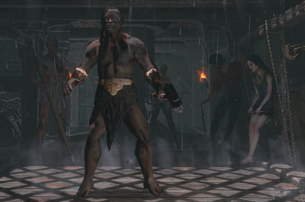 But if you even just look through other images of the Marauder from google search, you'll immediately see a character with a lot more, how shall we say, character? http://www.pathofexile.com/classes/marauder Perhaps it's as simple as the fact that's he's making an expression in the second pic, but it just makes him more alive as a character for me. My other complaint is of course, their outfits. I understand wearing a loincloth when you first arrive, but by the time you're smashing Piety with your X while playing as a Y, for the Z time, and wearing Holy God Armour of the Flying Pasta Gods, you'd expect your character to be wearing something a little better than tatters and no pants underneath. Aside from that, I'll start to keep an eye out for other notable art "issues" and screencap them and return to the thread with them. Keep up the great work! Last edited by Talfrey#1490 on Feb 15, 2013, 8:24:23 PM
|
|
|
The texture for the Wraith Sword 2H Sword is very low res.
|
|


