


Socket update
|
#Erik
I'm still preffer the old one design rather than this new concept. It looks like created by freshly baked computer graphic who has no idea about it. It reminds me a colorful candies, and i think that changing saturation will not help here. Why u just dont adjust the saturation or changing the colour of old ones sockets? Atleast give us a UI option so everbody can choose the one what he likes the most. Also i want to say that i dont like the new rectangle sockets what is dropped from monster. Before there was no problem to distinguish the 5-6linked sockets. Now if the items have 5 or more sockets i have huge problem too see is it linked or not. Espacially with blue sockets. So i'm preffer the straight arrangment too rather more than this 2x3 rectangles. Last edited by fearo#5366 on Sep 10, 2012, 9:34:42 PM
|

|
|
I think the main problem for the non color-blind people is mostly the design which doesn't fit with the art style of the game and less with the color intensity.
Is there a problem with a UI option for this? What will happen to the website in the UI option case? Last edited by georgatos7#2505 on Sep 10, 2012, 10:00:04 PM
|

|
|
I'd like to try all possibilities before adding it as an option. It should be possible to make it work with just one set.
Omnitect of Wraeclast
| |
|
How about instead of super bright colours, using a different texture pattern for each socket type, or a different shape?
If it's people with difficulty judging colours is what we are worried about, why not use geometry/shape/patterns to guide them instead? From black and white photography, I learnt that once colour is removed (or, when someone can't see colours) geometry /composition... in other words, shapes, becomes what the viewer focuses on. That means colour blind people may be naturally attuned to picking up on a pattern/shape difference even if it's subtle. (similar to the blind getting better hearing) Last edited by Roenie#7869 on Sep 10, 2012, 10:27:03 PM
|

|
" I like this idea. Keep the inside a circle and tone down the saturation, but have: - Octagons for red sockets - Circles for green sockets - Hexagons for blue sockets Or any different combination of the three. It's distinct for colour blind people, so the colours won't have to be so bright. Last edited by BurnOutBrighter#5741 on Sep 11, 2012, 12:48:59 AM
|
|
|
When we tried shapes it just didn't feel like sockets at all anymore. Here's an update:
 Omnitect of Wraeclast
| |
|
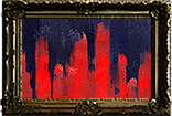
First, how the hell is there 5 sockets on a shield?
Second, I prefer these colours compared to what we currently have but it still feels plain. I really liked the old ornaments (is that the right word?) around the sockets. Third, the links are still hard to see on any item that has similar colour. Build of the week #9 - Breaking your face with style http://www.youtube.com/watch?v=v_EcQDOUN9Y
IGN: Poltun |

|
|
For me personally I find the current set of socket WAY too bright. I wear glasses and the colours to me are so bright It gives me a headache if I'm on the vendor screen for too long.
I also think it looks way too cartoony, the dulled down colours you have just posted annoy me less in terms of giving me a headache and detracting from the rest of the screen. However the cartoony look makes me not want to recommend the game to friends until the (old) art style is brought back. This cartoon effect really makes the game look cheap when it really isn't but sockets will be one of the first things people see. The very bright colours also clash terribly with the skill gem colours which doesn't help. Personally I see only 1 option to fix this.... old socket style as standard setting, and the new bright ugly looking things as a colour-blind option. Edit: Just saw a post in the patch 0.9.12c about a red/green colour-blind person who can now no longer see the sockets because the only reason they could see it was the MASS brightness. So yea more evidence that we need the standard option and a colour-blind option... and even in the colour blind options you might need a slider for them to set the brightness and stuff of each colour themselves as everyone is different. Although he also commented that he could tell the sockets apart by the different pattern/slits on each... maybe go back to the old style and make those slits more distinguishable? IGN: Amel, Ameladol, Spock, ILoveUniqueThings, AmelPVP Last edited by Ameladol#0651 on Sep 11, 2012, 6:07:53 AM
|

|
"You open 2 pictures in photoshop and put the one with sockets on the one with shield. Don't expect artists to put their art in game every time they create anything. New sockets are definitely nicer, but again, they are not smaller. Not that it's bad but patch notes said that sockets were made smaller :P |

|
|
I'm slightly colorblind (don't see green/yellow and red/orange rnge of the spectrum mostly), the current graphics (9.12c) looks great for me.
The one that came with 9.12 was atrocious when it came out, but at the moment I don't even miss the previous socket style anymore. If I were to be anal, I think Green/Blue are fine, Red ones could be a bit more distinct. In my opinion, there's no way you can please everybody, unless you add an option toggle in the menu. No good deed goes unpunished. Last edited by spectre999#5761 on Sep 11, 2012, 9:38:38 AM
|

|


