Post aura rage here. I will lock any other aura thread I see.
|
I honestly do think that the old aura's look a lot cooler... And GGG should bring it back !
|

|
|
i dont look colorful with my haste/purity/vitality anymore
|

|
|
The new auras are much sleeker in design and less bulky. The old auras were obnoxiously large and really didn't fit in to the game world. Very well done. However, I do agree that there should be a graphical option since it seems that a lot of people don't like them. However, labeling the new ones as "low" seems rude to the people that prefer them (I use an Alienware computer and have no issue with running the new or old textures). Maybe label them as "Classic" for the new ones and "Fancy" for the old ones? That would be better imo. :)
|

|
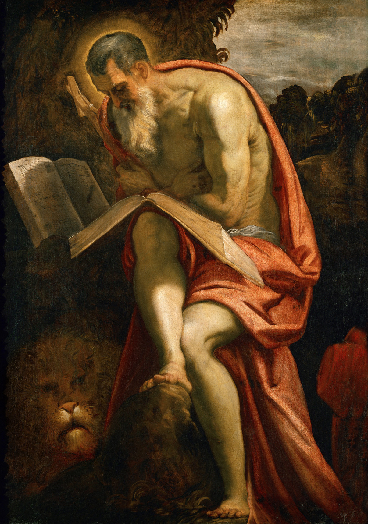
" You know, if you're actually going to try a semantic argument, you should know that literally every source regarding the abstract concept of an 'aura' refers to it as a very faint spiritual thing that only the enlightened can see in the first place, if at all. So if anything, the new auras are closer to the 'Correct' definition of Aura. When MOST people (people before the advent of the computer) speak of saints and prophets, they mention the faint and nigh-imperceptible 'halo' that surrounded them. Rather than the blinding form of Zeus that prompted them to kowtow and shield their eyes, lest his incandescence boil their frame to ash. Which is more comparable to the old auras. In classical parlance, especially in an art-historical context, this is what an aura is.  Those slight yellow brush strokes against the neutral brown of the tree. The little 'halo' there? that's the extent of an aura, when you hear it talked about among astrology enthusiasts and gallery roamers-- That faint light is the sign of an immensely powerful mortal. A small sign to indicate great inner power. And I'm reading too far into it now, but I want to keep that for our exiles. The only time you see larger ones are when some church figure decided he'd throw a lot of literal gold at your altarpiece, or the artist was trying to depict an Angel appearing or some other aspect of God with a capital "G" On that note, I'm all for the monsters we face being the only ones with the old auras. Why am I wearing a heavy belt if I haven't got any pants? Last edited by Milchut#7741 on Apr 8, 2013, 9:21:08 PM
|

|
|
Yes, as others have said give us options for higher and lower end options please.
|

|
|
Everything that matters has to do with lag.
Simple auras reduce lag across the board in every circumstance in which they are used. Those who once suffered an amount of frame lag due to auras now suffer a reduced amount of frame lag. All decisions made were correct. The outcome is unfortunate and correct. I look forward to enhanced visuals well tested and designed to be beautiful and low lag. For now FUCK lag. TY. Good change. |

|
|
New auras are awesome and clean. Actually i like to see at least what weapon is using my character
|

|
|
Give us GUI options, or give us death!
(Not literally though, I'm on hardcore and I've ridden the Vaal train to default town far too many times already). Options for the old auras would be nice, but I don't know how difficult it would be to display differently for each person. I would imagine it could function the same as texture quality though. I love the old auras when i'm running solo, but in a group I'd be totally fine with the less intrusive ones. |

|
|
1. Realise some people liked the old auras
2. Bring the old Auras as mirotransactions. 3.???? 4.profit |

|
|
The community on this game are a bunch of babies geesh.
"I'm not in this world to live up to your expectations and you're not in this world to live up to mine." - Bruce Lee
|

|


