August Expansion Teaser Screenshot #3
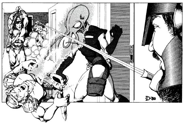
" Lurve me some classic D&D art! Darlene was hit and miss... That pic with the guys in armor... Where did they keep their toes? That lich on the shore was a classic, though. Also, under Dave Sutherland, you have a piece by David S. LaForce, and one by Dave Trampier. But that DCS III is the signature piece! Finally, that Jeff Dee was a great choice for dynamic illustration. Well done! Sorry to pick nits, but that's my misspent youth you're talking about. =^[.]^= =^[.]^= basic (happy/amused) cheetahmoticon: Whiskers/eye/tear-streak/nose/tear-streak/eye/ whiskers =@[.]@= boggled / =>[.]<= annoyed or angry / ='[.]'= concerned / =0[.]o= confuzzled / =-[.]-= sad or sleepy / =*[.]*= dazzled / =^[.]~= wink / =~[.]^= naughty wink / =9[.]9= rolleyes #FourYearLie Last edited by Raycheetah#7060 on Jul 30, 2014, 7:00:31 AM
|

|
" +1 !! " +1 IGN PPPPanddddaPPPPanicccc
still waiting for that 'Chris Wilson-director's cut' version oh wait, I finally got it. Thanks team! |

|
|
Wow.....NOT! How about giving us an option to change the chat window size and font, that whould be a great thing. Hope that's not all you planned to change in game cuz as i see it, it's just useless changes to gameplay.
|

|
" I never noticed that the elf sollerets were a little bit tight in the toe box. Maybe Elfadins have to be ready to go en pointe at any time? Thanks for correcting the artists. One thing I think PoE could benefit is adding some slacker NPCs to provide a comic foil for all the dismal stuff.  PoE Origins - Piety's story http://www.pathofexile.com/forum/view-thread/2081910
|

|
" This. I'm not a fan of the new UI but having different presets would certainly be the best option. |

|
|
Thanks for keeping the naked slave girls :D
but on option to customize UI would be nice too. at least for the very few who dont like the slave girls ;-) |

|
|
I just wanted to drop by and say that it has never bothered me that the statues are covering part of the life/ES/mana pools. Also, I would like to think that beautiful women have calming, healthy effect to any player. For equality, maybe have both male and female statue in the future? Not just two of one gender. I would keep the girl on the right :)
| |
|
GGG please follow your own style and implement a classic Roman style, please ignore all invalid sexistic motivations, those have nothing to do with style and are probably the majority of posts asking you to keep them.
BTW: Ridiculous that you changed back in a couple of hours during European night, guess we had nothing to say about it.. Last edited by Startkabels#3733 on Jul 30, 2014, 2:43:37 PM
|

|
|
in my opinion GGG wants to change something that does not needs work or replacement in the first place,i think that's why most of the people got so crazy about this.what is worse is that it's not looking good at all,i cant think how in the world that meeting went like a room full of people(i'm guessing it's a team work when taking decisions in changing something in the game)all agreeing that that new UI looks better or is good for marketing and that it will sell.makes me question their decisions in the long term.yes looks like a small thing,but small things always make the difference,i mean c'mon that UI is the one thing that will be constantly there to see,it's ugly to put it up and simple,there is no classy looking,nor elegant,nor marketable.
i'll be back for the new leagues to try it out to see what was so necessary that something that was actually good in game had to be changed Always be good to others you gain nothing by being mean!
| |
|
This is important enough for me to write my first post on PoE forums, after hundreds of hours in the game.
I saw the first announcement screenshot, I thought - "ok, some red drape hovering over a guys head... Is marauder completely bald? Don't care... should check out skill icons - nope, nothing there. Health globes? Same. Good. GOD. The art on the globes is amazing. Love the way the chain goes right through the mana globe... She's facing outwards, and the other one on the life is sort of embracing it, creating a nice warm feeling to it. Love the contrast. Very rarely you see something sexy and smart at the very same time. Good thing they are not changing this." Then I moved on to the second one. It was like they did it on purpose to piss me off, after I just mentally admired skill of the great artist that made the UI. I refuse to believe it's the same person who made the new one. I know it's not. Because the first one is brilliant without compromise, and the second one is scared. "Oh no. Too much tits! It covers the globe! Need to change! POOF! Small muscular/fat people." I should be relieved that they finally decided to change it back, altough I'm not - because I have read that they still want to change it. Don't. The girls are perfect. To all of you that want the change beacuse you cant see all of your mana globe, let me just prove you wrong - you're wrng. And please, dont bring it down to some sexist bullshit. If you say that I need the naked girls beacuse I'm a male idiot, you are only half right. By the time you have read this you should know which half is true. I really hope when they finally do change this, they will keep the old UI as optional. Last edited by Razis#4500 on Jul 30, 2014, 6:58:39 PM
|

|


