August Expansion Teaser Screenshot #3
" To me it looks like the Health globe is an oblong shape angled to point towards the right which makes it feel... odd. Can't you just make it circular (Center bright, edges dark) or at least eliminate the Energy Shield portion creeping in to the neighbouring framework? It's like you're trying to give the impression of observing the game via a curved LCD TV, via a flat display. Computer specifications: Windows 10 Pro x64 | AMD Ryzen 5800X3D | ASUS Crosshair VIII Hero (WiFi) Motherboard | 16GB 3600MHz RAM | MSI Geforce 1070Ti Gamer | Corsair AX 760watt PSU | Samsung 860 Pro 512GB SSD & WD Black FZEX HDD Last edited by Nicholas_Steel#0509 on Jul 29, 2014, 11:55:32 PM
|

|
|
Berek's Grip Ice Spear
http://www.pathofexile.com/forum/view-thread/780707 Budget Magicfind and/or Hardcore Flame Totem http://www.pathofexile.com/forum/view-thread/1211543 |

|
|
Nice! Kitty + New Menu and Shop buttons = Path of Exile, the Tale of Angry Birds. Should be compatible with my smart phone aye?
|

|
|
wow GGG you initiated a revolution with just a couple of Screenshots...
I still don't get it, why changing the UI while there are a thousand more important things than aesthetics to look into ? Wasn't more urgent to make chat UI resisable and movable for example? Very disappointing. Last edited by sfrattini#0833 on Jul 30, 2014, 2:09:14 AM
|

|
|
I hope GGG take some of these ideas into consideration, they look heaps better and stops the game from looking 'cheap'
PLEASE do not do a quick fix like you did in the past (everyone who played open beta remembers the new mouse cursor....) |

|
|
Don't touch the slave chick statues FFS!!!
WTF were those gay hobos??!! Don't you have better things to improve with your time/$??? When night falls
She cloaks the world In impenetrable darkness |

|
" Only a thought but I do like the sleek look of the girls in chains. As well as the thought of having similarly sleek options/skins one could buy to change it up now and then. |

|
|
The old statues have been restored. We still intend to remove them in favour of ones that cover less of the health/mana orbs, but have moved this to a longer-term change. The new statues will have a classical Roman look that better fits with long term stylistic goals.
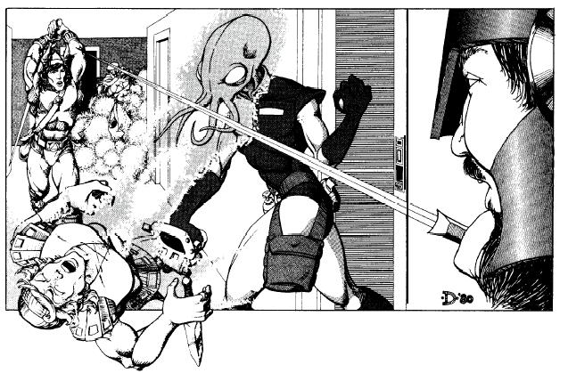
Original Classic Orbs:  Anticipated Classical Roman look orbs:  Why not allow the option to keep the old life/mana orb look? Please take a look at some of the original D&D art work by Erol Otus, Darlene Pekul, David C. Sutherland III, and D.A. Trampier, then contrast it to the bland newer versions. There's a story being told with the art. The original art has a certain nostalgic value that can't be replaced. It's like Venom Spider Man vs the original Spider Man costume. Imagine if you received a letter from Wizards of the Coast and it said: "Please send in all your old MTG cards. We are updating the art work on all the cards. We know you cherish the old artwork, but it's time to move on." I can understand where the current orbs may not appeal to a certain market element. Why not make some UI elements optional and allow players an option to choose something other than the default as an MTX? I'm sure many would choose the classical look, and with a choice there would probably be quite a few that choose some newer look. Blood dripping orbs, flaming orbs, skull orbs.... Personally, I would love to see an MTX that let me have the new clarity MTX on the mana orb. Some of Darlene's work:
Spoiler
  Some of David C Sutherland III's work:
Spoiler
   or D.A. Trampier
Spoiler
 Some of Erol Otus:
Spoiler
 In the end we are either left with something exciting like this:  or something drab like this:  PoE Origins - Piety's story http://www.pathofexile.com/forum/view-thread/2081910 Last edited by DalaiLama#6738 on Jul 30, 2014, 5:29:43 AM
|

|
|
Come on guys. This proposal about a "coin" shop button is so bad in terms of UX. No way GGG would even consider to implement it like that. It does not look like a button. In fact it does not look even clickable or anything. No one will ever click on that thing...
GGG needs to generate some money and making a clearly remarkable shop button that is visually appealing is very important. That's why a "$" or "SHOP" button with something different, like a green color scheme, is good. It might break a little overall UI layout or color scheme but it's clearly a must for their business needs. Last edited by Stlan#5710 on Jul 30, 2014, 5:52:47 AM
|

|
|
For my opinion, changing User interface buttons is not a priority and current buttons are already user friendly.
It is better that developpers concentrate their efforts in new content in game. I don't see something notable in this teaser. Good luck GGG ! * Thanks for replacing old statues :) Last edited by fantominus#3765 on Jul 30, 2014, 5:57:22 AM
|

|


