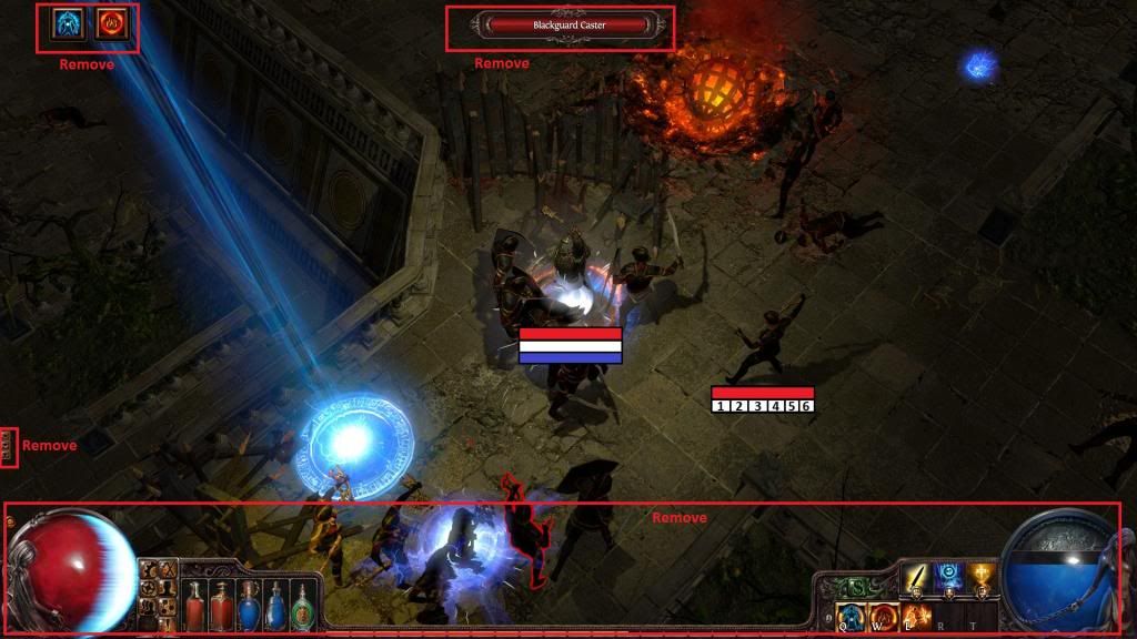
August Expansion Teaser Screenshot #2
" They heard that someone might be enjoying a video game and felt the need to fix that for the sake of women world wide. |

|
" In b4 anita sarkeesian video explaining why sexy statues encourage rape. | |
|
guys, please, when will you make that chat arrows on the left HIDEABLE? I`ve died so many times just because the chat appeared when I wanted to escape to the left and was clicking into the caht instead of ground (to move)
UI`ve reported that a few times, also via /BUG (yeah I know it`s not a bug) but looks like nobody`s listening So please! make it hideable in some menu - GUI, I was never using it with that arrows, ENTER is enough to write into chat for me. Hope you could improve - add an option to hide / remove the chat arrows, so the chat window won`t appear when I move mouse cursor to the left, over the arrows. Thanks in advance |

|
|
The shop should be hidden with the other screens, the skills could also use a menu just like them and finally, all should be in one corner, not divided into two parts. The flasks should have numbers over them displaying how many uses remains instead of guessing it by looking at how filled they are.
I also suggested a while back for an option to remove the UI and have life/mana displayed as mini bars, just like the ones you can toggle for enemies. In other words, making the buttons into one menu is an improvement but it's not enough old example:
Spoiler
 |

|
|
LOL at the mana orb men, i fucking love it. LOVE IT! Once again proving how awesome GGG are.
*reads GGG post* Oh, it's not 2 men, not a joke, it's supposed to balance the sexes, censor sexuality, and appease the whiners. Do not approve. AT ALL. :P Just put a male and female with full frontal already. Be independent! *Reminisces*... I remember when GGG used to be awesome... ;) Why i thought the left is male are the elaborate back muscles. P2 (SSF): 85 Infern; 72 Warbr PoE character archive: view-thread/963707 SC: 95 97 96 100 95 96 97 98 95 97 HC: 96 (dead) Last edited by unsane#5479 on Jul 28, 2014, 11:37:03 PM
|

|
|
there is simply no reason to have........old men as globe mascots..simply no reason
if the old school females in chains are an issue, might as well make it unisex character, neither male or female shop icon stand way too out from the darkened UI....that's like buy buy buy |

|
" Just turn off the channels? | |
|
I was also surprised that people said that that was a male on the left. It looks like pretty much every female statue ever.
Venus Reclining Female The statues and globes are very well done. This in turn makes the rest of the UI look a bit out of place. Globe art has a very 3D and detailed feel while the rest is quite flat and cheap looking. Last edited by sharkh20#2500 on Jul 28, 2014, 11:40:39 PM
|
|
|
Why do I have to look at a guy's ass on the bottom left?
Chris, get your crap together. You know that is a horrible design. Seriously. (irregardless if it's a male or female, first impression was I figured it was a male) "Good thing they nerfed the carto, it wasn't fun to find one in every map." - Haborym Last edited by monkuar#2123 on Jul 28, 2014, 11:43:21 PM
|

|
|
While we're on the subject of orbs, can you fix the whole ES white curve shield counter so that its completely white when you spec CI?? This is an easy thing to overlook if you haven't played in a while, or play many different characters often.
I'd prefer that the life orb be completely white with no red in it if you are CI. At the very least I'd hope for a white curve that covers 75% of the globe when going CI. New user friendly too. I wonder if Hillock-Senpai will notice me when I go to town?? Last edited by StrayYoshi#3559 on Jul 28, 2014, 11:45:18 PM
|

|


