Path of Exile and J!NX Shirt Design Contest
|
So, how about you have like a beaten up brick path, commonly found in game, with all of the class characters facing an arch doorway too bright to see through, scion in the middle of course, and the remains of bosses such as piety, vaal, brutus, merveil, etc lying on the ground behind them. And the beautiful Path of Exile logo floating above the archway
This is my submission Last edited by Master247#6031 on Dec 13, 2013, 11:34:31 PM
|

|
" I don't want to over react...
...but
BAAHHAHAHAHA! That made my night.
Devolving Wilds
Land “T, Sacrifice Devolving Wilds: Search your library for a basic land card and reveal it. Then shuffle your library.” |

|
" this one is good :o |

|
|
This is my submission:
 |

|
 This is my submission. Obviously there are more orbs/currency, but ran out of room. Could be re-sized to add a few more (orb of first steps--orb of transmutation, and orb of +1 ES--orb of augmentation) Block & stun recovery orb should be renamed "Orb of block & stun recovery" Sorry for the quality, I don't have photoshop. Last edited by nnerl1n#4754 on Dec 14, 2013, 12:49:06 AM
|

|
|
This is my submission:
 So my idea is simple, I apologize that my paint skills are not up to par. I think having path of exile at the top would be nice with the three attribute ring in the center. Instead of numbers in the rings you can place the corresponding attribute to it (Int, Dex, Str) Then around the rings in the respected positions place the name of the classes. Any font could do along with just having a plain black or white back drop, depending on the capabilities for making shirts. Thanks for your time and consideration, and good luck to everyone. |

|
|
This is my submission
One of my favorite things to do in Path of Exile is to try to chance a unique, so I made the subject of my shirt design reflect what I commonly experience (lots of magic items). Here is a draft of my "failed chance" design: 
Spoiler
Alternate text: "not every shirt can be unique" (with "unique" colored orange) I intentionally made the text out of alignment but it could still use some moving around and size adjustments. The Orb of Chance could also be moved around or layered behind the text. I also considered making the orb the "o" of "supposed". Edit: It seems that the colors are much lighter here but you get the idea. Last edited by florian#5103 on Dec 14, 2013, 1:44:50 AM
|

|
|
My 3rd submission. I tried making a screenshot but couldn't get enough monsters together.
Background picture of a marauder holding a two handed mace, back to the wall surrounded by tens of monsters (the more the better). The caption above or overlay onto the picture reads "Your back to the wall, you can't take another hit, you're almost out of mana. What do you do? What do you do?" Underneath the picture reads "You kill them all" Last edited by IchiMorghulis#4560 on Dec 14, 2013, 1:56:33 AM
|

|
|
This is my Submission:
scatter the new portal skins/designs over the shirt (various sizes of portals but not too many or too big in size) Then have text near the bottom, top or middle with the word "I Arrive in Style!" I think works in the middle with portals randomly placed around it (looks better than having them in a circle around it) would be ideal :) Hope this makes sense. |

|
|
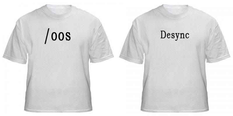
These are probably the most fitting to this game:
 Last edited by lucksickle#6250 on Dec 14, 2013, 1:59:50 AM
|

|


