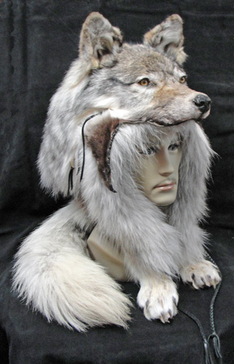
Petition for changing back Alpha's howl and Starkonja's head 3D ART
|
That bear looks pretty lean.
|

|
|
I like the new art a lot more actually
IGN: timtwins, timtwinz
|

|
|
the 2 uniques look a lot better than that shit in the middle, they look like their artwork.
|

|
|
Sup
I sold my Alphas just because i couldn't put it on anymore. It looked so ugly that i wanted to vomit. Really some retarded halloween mask for children. Last edited by _TaZaR_#1953 on Nov 26, 2013, 3:00:46 AM
|

|
|
All the animal head gear looks stupid imo and once I find a good helm I will use for a while a slap a skin transfer on them. Not sure if that is possible with uniques tho.
| |
|
When i look at those pics i can tell why the new designes look so "bad".
They forgot to add fur on the sides. Alpha Howl right now looks like this  How it should look  So yes. The new designes are not very good. What can never be lent or earned? Somewhat, that devours everyone and everything: A tree that rush. A bird that sings. It eat bones and smite the hardest stones. Masticate every sword. Shatters every shrine. It defeat mighty kings and carry mountains on lightly wings. What am i? Last edited by Spysong192#7559 on Nov 26, 2013, 3:44:42 AM
|

|
|
use the headless mod.. its the best thing to do with any helmet! ;)
|

|
|
What da fuk were they thinking when they maded the new art for alpha and starkonja?
Those hats now looks like a disney hat.... |

|
|
old art was much better.
IGN: Arlianth
Check out my LA build: 1782214 |

|
|
New Starkonja looks absolutely terrible, cartoon like.
|

|


