Art, Areas, and Effects Feedback Forum
|
if you want effects feedback here's one you may want to reconsider:
the darkness in act2 none the less is exactly the same as in D2 act 2. might want to think about how many players will associate it with that game the second they see it happen. although the npc comments are really funny when you do turn out the lights I'd suggest a slight change like using a different color as if a moon or something has suddenly changed the environment (red or deep purple or whatever) this could keep the comparisons to a minimum. |

|
|
I like the GUI
|

|
|
I found the blue tone used in Cavern of Wrath and Anger a bit too much 'overdonely' It made me feel like i was trying to avoid seeing that blue tone which is very static, bland and dull. It needs variety in the highest order tbh. Maybe devs who's in charge would want to check and re-work again.
It seems only that blue tone consisting off of the walls of the two places and nothing more which makes the areas boring and flat. 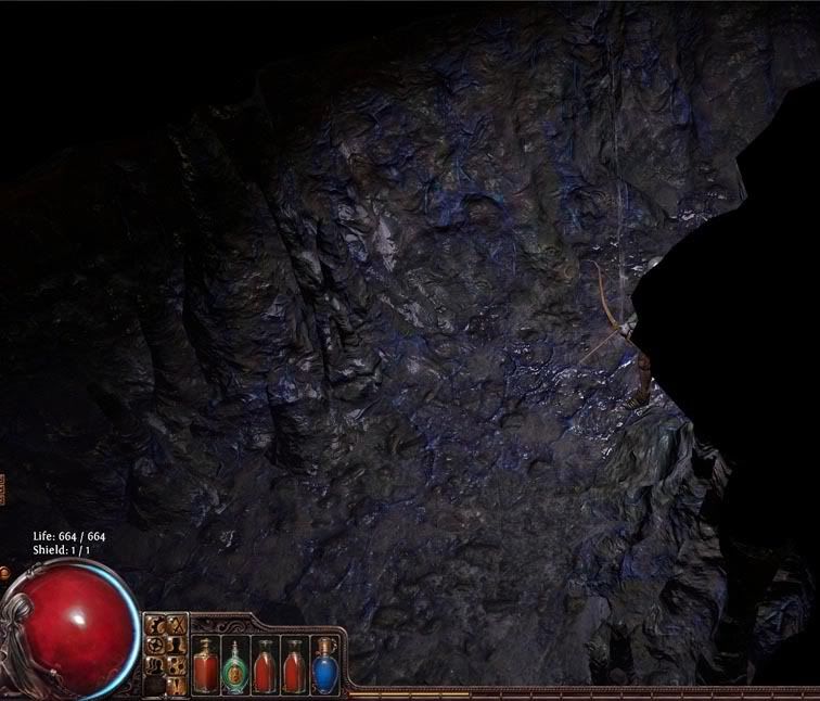 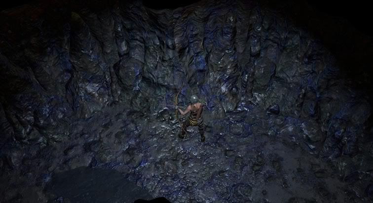 Both places are the carbon copy of each. "This is too good for you, very powerful ! You want - You take" Last edited by BrecMadak#3812 on Jul 28, 2012, 3:13:48 PM
|

|
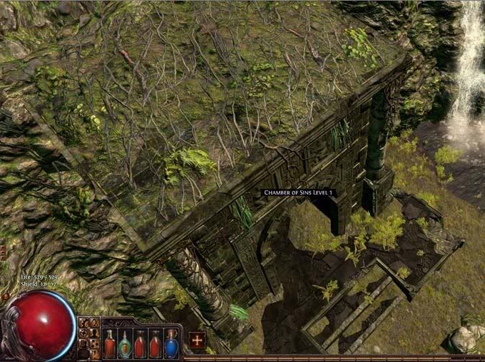 A statue could be added onto the roof of Chamber of Sin maybe or a lurking special beastie would make you wonder what is inside of the dungeon. 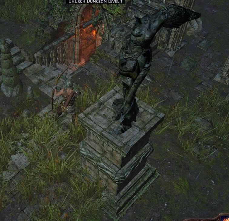 Also i would want to point out that statues on front of the entrance to Church Dungeon don't look well, you hardly could see what they are actually, i think they are angels right ? Something along the sign of an evil icon would be better i think. An impaled/desecrated angel statue would be a lot cooler and set the atmosphere overall better. 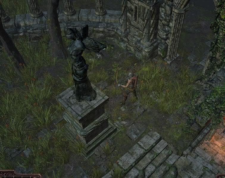 "This is too good for you, very powerful ! You want - You take" Last edited by BrecMadak#3812 on Jul 28, 2012, 3:31:18 PM
|

|
|
Well I've been working on the Health and Mana orbs. I found them a bit bland and not really fitting in the rather dark themed gui.
I've worked as an texture artist in the past for several game mods/projects. So here is my take on them WiP:  Last edited by AaGeOn#1190 on Jul 28, 2012, 7:38:07 PM
|

|
" that looks awesome! My little tribute to Diablo 1 aka why Diablo 3 is the worst part of the series.
http://www.youtube.com/watch?v=zP2ejhudUlU ig: Witchfire_The_Unholy |

|
|
Damm why people cant open their eyes ! another feeback from a D3 fanboy ...
http://us.battle.net/d3/en/forum/topic/6202121727 |

|
|
http://steamcommunity.com/profiles/76561198006745609/screenshot/594725348009947410/?
Cathedral, Level 2, Missing Tile. |

|
|
The red backing on full ringmail chests looks a bit out of place with the normal quite realistic armour - maybe if it was toned down a bit?
|

|
|
Personally I find the map overlay hard to use. The transparency and colors just make it very hard to see where you really are.
I am not sure if something like what Guild Wars uses could be a better solution. You press a key like "U", a map pops up showing where you are with graphics of surrounding, as well as the path you have taken since zoning in. |

|


