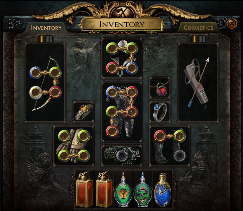
In the recent Baeclast Podcast with Chris Wilson, we asked for people to email us with their feedback about what improvements we could make to Path of Exile to support our colourblind players. We received a lot of helpful insight and are appreciative of everyone who contacted us about this. One of the key pieces of feedback was that while it has been helpful for us to try to modify colours to look distinct from each other, the most effective method is to also ensure that there is a clear difference in shape between elements.
One of the first changes we're making based on this feedback is to add notches to gem sockets that indicate what colour they are. These notches correspond to the layout of the passive skill tree. For example, the blue socket notch points upward to represent the Intelligence area at the top of the passive tree.  We'd love to get feedback specifically from our colourblind players about this but also welcome feedback from all players. We look forward to hearing from you! We also wanted to remind you that Chris Wilson will be appearing on another community podcast tomorrow on Ghazzy's Twitch channel alongside fellow streamers Grimro and Crouching_Tuna. Tune in on Sep 01, 2021 4:00 PM (EDT) (this is displayed in your local time). We've also made a countdown for you here. We look forward to seeing you there and hearing your thoughts! |
|
|
I'm not a coloblind person, but is there not a problem with Blue pointing up and links also pointing up?
|

|
" I was literally about to point this out, and possibly suggest the lines go inwards towards the socket instead. | |
|
You sure notches are the way to go? Can't you slightly change the gem slot shapes so they are for example square, diamond, triangle instead? Wouldn't be that clearer?
Last edited by piotrek360#5834 on Aug 31, 2021, 6:16:49 PM
|

|
|
Why don`t you put blue mark at 45 deg, green at 135 deg, red at 225 deg and white at 315 deg? It wont`t collide with the links that way.
|

|
|
Exactly the same thing. It's not possible to distinguish white from blue if that's the case.
|

|
|
The blue socket's notch is not visible when linked upwards.
|

|
|
This seems a very clever way to help colourblind people but I'm also curious about the blue sockets that may be linked pointing up
|

|
|
Not sure how to feel about this, you speak about a clear difference all I can see are barely noticeable lines. I’d have really preferred it if you just changed the socket layout to something like red = circle, green = square, blue = triangle and white = hexagon. Blue won’t even be visible when linked upwards, bad design imo.
Last edited by Prov1eh#1157 on Aug 31, 2021, 6:19:53 PM
|

|
|
I vastly preferred the old PoE gem slots, but better than nothing.
https://www.reddit.com/r/pathofexile/comments/9ckdhd/colorblind_mode_for_gem_sockets/ |

|


