Character Screen Menu and Character Screen Selection
more like these...
Add Character Screen in [ESC] menu

and in Character Screen Selection like this (not actually like this, but with current equips view-able and with rotation)

hoping for reactions/comments....^_^
seamonkeys stole my hammer Last edited by dredd018#6545 on May 11, 2012, 2:01:00 AM
|
Posted bydredd018#6545on May 11, 2012, 1:59:50 AM
|
|
Is there any way to make a font size bigger on a character screen. I love those details, but it is a little hard to read. I am age 40 and my eyes are not so good at smaller display:-)
This is a wonderful game. Thank you so much!
|
Posted byPercy2012#0197on Jun 29, 2012, 11:18:42 AM
|
|
(Posted in Beta feedback too)
Hi Guys
Loving the beta so far so thought i would start a thread i can add to as i think of stuff that may need to be addressed.
So far the only thing that really jumps out at me is the fact that its really hard to tell, at a glance, whta items a re waht in my inventory/stash.
What i mean is that all items, whether white, blue, yellow etc have all the same background colour and you can only see by mousing over them.
Any chance of having the background of an item reflect its uniqueness ie white items have a clear (black) background and magic items stick with the now blue background and rares would have a yellow shade to their background.
This would make sorting and viewing items a breeze and would really improve the look of the inventory and equipment slots.
Cheers
|
Posted bystalkerfan#6616on Jul 5, 2012, 7:04:51 PM
|
"
dredd018 wrote:
and in Character Screen Selection like this (not actually like this, but with current equips view-able and with rotation)

Love this idea. I'd be even happier with just the skills showing next to the character on the selection screen, like so:

|
Posted byPsychofrump#4229on Jul 14, 2012, 3:35:37 AM
|
Could you please add a secondary column in the character tabs that have the base stats which the % passive nodes are applied?
Also, could you shade every second row slightly darker than the one before it?
Example:
 |
Posted byjvp#2017on Jul 16, 2012, 1:06:44 PM
|
"
CyNEXX wrote:
In the inventory, there should be an easier way to compare items. So when you are hovering over an item with the cursor you should be able to also see the equipped one so you can easily see the differences.
I echo this point. When trying to play with this drawback in mind, I often have my stash open, place an item in my backpack for comparison, and instinctively hit 'C' to bring up the character screen. This closes the stash and thus my backpack. Can pressing 'C' with stash open simply open the character window over the stash graphics, or at least close the stash and keep your backpack open? I mentioned it to others and they have felt the same. /anecdote
Great game! Soooo addicting.
|
Posted byNakedTuna#4701on Aug 7, 2012, 12:55:25 AM
|
|
I will like to be able to see the character tab in the web site, similar as we can see our stash and inventory. This will allow me to do some maths at work ^_^
http://nerdicogaming.wordpress.com
|
Posted byDi77#1569on Aug 8, 2012, 11:12:15 AM
|
Please add alternating row colors to help differentiate the lines. Black and dark grey, black and dark red, etc.
Example:  |
Posted byFender117#7480on Aug 11, 2012, 4:01:35 PM
|
"
dredd018 wrote:
Character Screen Menu and Character Screen Selection
more like these...
Add Character Screen in [ESC] menu

and in Character Screen Selection like this (not actually like this, but with current equips view-able and with rotation)

hoping for reactions/comments....^_^
I love the idea for the character selection screen.
|
Posted byMizzajl#7895on Sep 2, 2012, 6:57:45 AM
|
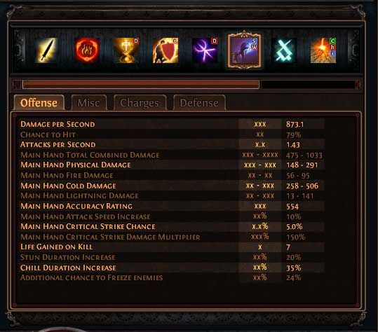
i had some problem with dps numbers on some characters.

so for calculating the total dps of the skill i take the numbers i marked in the picture and calculate like this:
0.85 * 1.59 * ((43 + 206) / 2) * ((0.116 * 1.8) + 1) = 203.39
but ingame the dps show as 183.8
i did the same calculations on another character and it was correct, am i missing something? or is the character screen just wrong sometimes? :)
Edit:
Spec:
Edit 2:
i think i figured out the Vilain in the calculation :)
i tried calculating all my damage from scratch and the mainhand combined total damage is correct after all damage modifiers and rounding up.
and i can get the dps right if i dont calculate the "Weapon Elemental Damage" wich i get from my items. in this character's case i got a quiver with 25%
so the "Mainhand Total Combined Damage" is correct and includes the "weapon elemental damage" from items. but the DPS is wrong and dont include "weapon elemental damage" from items. Last edited by Mizzajl#7895 on Sep 2, 2012, 7:36:50 AM
|
Posted byMizzajl#7895on Sep 2, 2012, 7:15:33 AM
|