Path of Exile and J!NX Shirt Design Contest
|
Here's my second entry, giving Ice Nova some love:
 First Entry:
Spoiler
" |
|
" I quite like this one, would wear it, tho the eyes of the Scion look a bit... closed? |
|
" This is great in game humour for all the painful hours of crafting. It needs a little refining, but it's a great laugh all poe-ers can connect to, or non-poe-ers to enquire about~ |
|
|
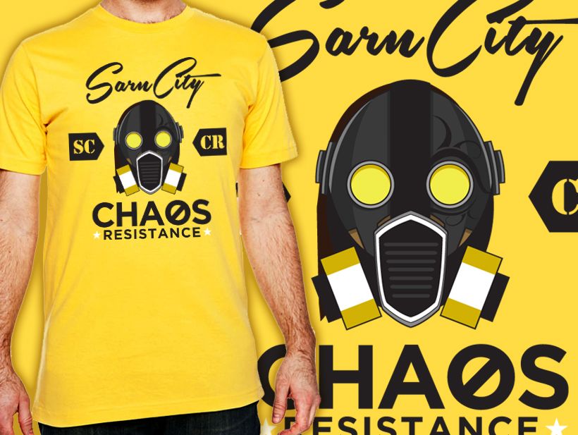
This is my submission.
I thought of things that not only makes PoE unique, but also relates to all players. I landed on Chaos. I did a wordplay on Chaos Resistance and turned it into something else.
Spoiler
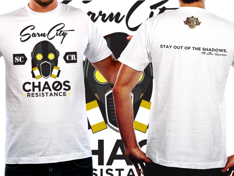
 I initially designed it for a black background but I decided against it since it felt too overused. I then went for a yellow background. It seems to fit with the theme of my design. To be safe, I still made one on a neutral background and went with white.
Spoiler
 While doing the white background, my design felt incomplete. I decided on adding something simple on the back. It ties everything up and rounds out the concept.
Spoiler
 Finally, the plain layout. I have seen a lot of amazing (and hilarious) entries on this thread. Looking forward to seeing more art/entries! IGN: Shiruda/DramaHotdog/JauntingLizard
"60% of the time, it works all the time." | |
|
This is my submission.
"Embrace him" It's raining hard, and Dominus kindly offers you an umbrella. A black shirt, with the top quarter of rain drops in red. Text would be at the bottom of the chest level, I think. The blood rain wraps around front to back across the shoulders Here is a quick draw-up of what I mean, the style is preferably cartoonish, at least on the front - I think the back can be a 3D-render closeup instead of around the other side. That could also work. Shirt front:  (alternative front text: Would you like some shelter?) Shirt back:  NB: the umbrella would be transparent and in the same style as his proximity shield. Dead exile behind him. Last edited by zharmad#7992 on Dec 27, 2013, 2:23:56 AM
|
|
|
Submission:
 Version 1.0.5 Trying to hammer in the theme of "mapping = endgame = items" with the map device activation window, but after putting them together, it looks kind of... off. Maybe the curling flowery pattern clashing with the skull. Might roll back to v1.0. Thanks for the shoutout Qarl! | |
"  This is how it looks like on a shirt. It could be a different color, but I imagined it of this size, on the back :) On the front there could obviously be the path of exile logo. Thank you Anuh for the Dali comparison xD and thank you for the feedback guys. I tried to modify the eye of the scion slightly, it is open and white, like the one of the marauder. "There are worlds that lie beyond the edge of my page, the edge of my understanding. Worlds of wonder. Worlds of terror." Aramil - Cartographer to Emperor Chitus
2018 Fan Art Contest Top 20: view-thread/2186731 ||| 2014 T-Shirt Contest Winner: view-thread/759460 ||| "Lost Worlds" Div Card Creator |
|
" Scion eye looks much more defined now, awesome :D Last edited by LethalCoke#5836 on Dec 21, 2013, 4:16:23 PM
|
|
|
Spoiler
" Мan, it's just absolutely cool, smart, short and original concept and realisation. Great job. And i'm honestly sure it's deserves one of the main prises. ...imo scion's eye still need a bit work. |
|
|
Spoiler
" Very nice shirt. |
|


