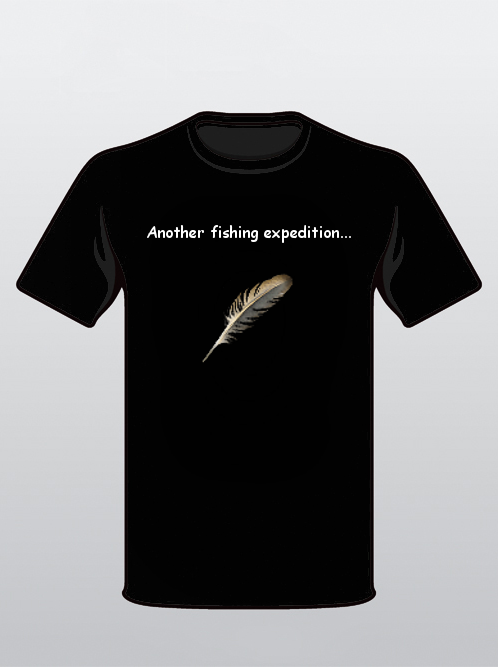
Path of Exile and J!NX Shirt Design Contest
|
There are 40 pages of replies so I don't know if this has been submitted before or not.
If not...this is my submission. Character selection screen with or without the background (not sure what would look better). All the classes standing there in the boat. Alternatively, there could be a shirt for each class of the same style. When you select a character they come closer to the front and do a cool move / pose. The shirts could be the lineup of classes behind a specific class showing off their stuff - like on the character select screen. |

|
" Yeah! I want a shirt with currency shown! :D Maybe it could say something about trading and not a gold currency game. We don't want people to think those are equipment items. It's still quite nice. |

|
|
This is my submission
On the front of the thee there will be a health globe. It will have 70% (or more) reserved. (This is to make a low-life build) Above the shirt should be the text: "I have no life." It should be visible to anybody (who has played some computer games) that this is a health-globe, thus it shouldn't be 99% reserved. It should still be possible to see the red part of the globe. This will make sure that people outside poe gets the idea: "Hmm, thats a health-globe, but he doesn't have much left... *read the text* Ahh, i get it". People that knows PoE will of course get the joke, but this will make sure people outside PoE (old D2 veterans anyone?) still get the idea. | |
|
This is my submission:
Same as the tabula rasa shirt, only 6 sockets with zero links. On the back: "WTB Fusings" |

|
|
This is my submission.
I need to get to a different computer so I can do fancy tree designs and glow effects for the line. Basic idea is there though and so is a 1 minute outline for extras that I plan to mock out.   |

|
|
"these are my submissions"
http://i517.photobucket.com/albums/u333/_Acidburn_/getripd.jpg http://i517.photobucket.com/albums/u333/_Acidburn_/GETLINKED2.jpg http://i517.photobucket.com/albums/u333/_Acidburn_/gotresist.jpg http://i517.photobucket.com/albums/u333/_Acidburn_/POETRIBAL.jpg http://i517.photobucket.com/albums/u333/_Acidburn_/rogueexileinc.jpg http://i517.photobucket.com/albums/u333/_Acidburn_/gotmaps.jpg http://i517.photobucket.com/albums/u333/_Acidburn_/DESYNC.jpg http://i517.photobucket.com/albums/u333/_Acidburn_/roughlife.jpg Last edited by idolkiller#0426 on Dec 17, 2013, 5:11:33 PM
|

|
|
This is my submission:
 Drawn by a haunting voice, you come to the PoE forums. It is an odd place, filled with a motley assortment of feedback... and shameless trolling. There, the whining posts are all around you, and the gamers are silent, as the grind takes ahold of them. One by one, their lives seem lost to its call.
|

|
|
"This is my submission."
 Last edited by Dethbringr#5516 on Dec 13, 2013, 4:58:28 PM
|

|
|
This is my submission
Any Color Shirt + Readable text color Text: This Shirt is Duped with an Mirror One day, somebody's gonna have to make a stand.
One day, somebody's gonna have to say enough Remember the Dead, But Fight FOR THE LIVING |

|
|
My post suggestion - will just describe it for you since I'm sure there are far better artists.
Front of Shirt (Black Shirt) Captain Fairgraves - Pirate Hat (+White Roah Feather) + Skull - Burning eyes (Allflame / green effect) Should be facing directly - centre of T-shirt - large image Back of Shirt Welcome to Exile! (Path of Exile logo) --------------- I really like the idea back on Page 13 by PoE17 - the class circle nodes works really well, would love that design for the back of my shirt :D *************************************************** (Repost from page39 with Pic) Here is a very quick photoshop mock-up of the general idea I was going for (yes my photoshop skills are terrible... image is made up from several images online heavily modified) “This is my submission” - IDEA 1  Here is a 2nd Pic Example with PoE logo and more green flames - I like this one as well :D “This is my submission” - IDEA 2  Last edited by Valley#1277 on Dec 13, 2013, 4:50:08 PM
|
|


