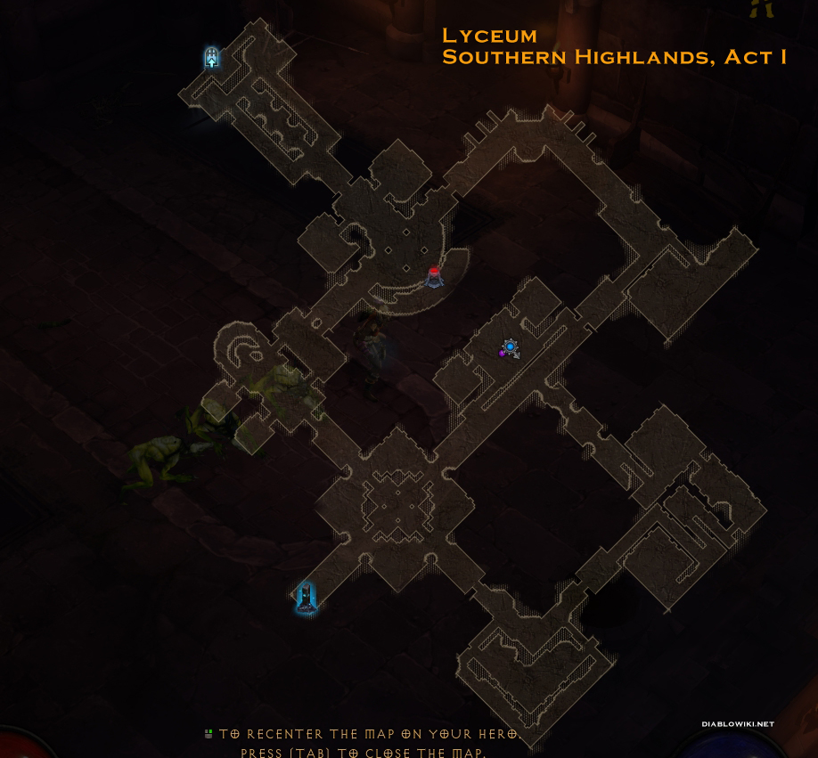
Preview of the New Minimap and Super Stash Sale
" Completely agree. If there is one thing that should be done like D3 it's the mini map. Map should be clear and concise. I don't need to see stuff on the floor on minimap, I just want to see where I can go. The detail is completely redundant on the overlay. It's a big improvement nonetheless. |

|
|
I looks much better, but I think the blue vision line is unnecessary. Still much improvement over the current one, thanks!
|

|
|
this is just WOW!
|

|
|
New minimap is awesome ! Great work !
Hf :)
|

|
|
Very very nice!!
|

|
" +1 Please copy D3's map, and class gender selection. |

|
|
Sorry to be blunt, but this change should have happened two years ago. If you guys need engineers, hit me up. It'd be nice to see PoE maintain its spirit but improve on its delivery.
|

|
|
Regarding readabilty, have you thought about making the detailed model layer optional too? The walkability layer on its own actually seems like a pretty good simplistic minimap.
Last edited by Ahtras#1249 on May 12, 2017, 11:30:05 AM
|

|
|
This is yummy. 3.0 hype!!
|

|
|
YASSSSSSSSSSSSSSSSSSSSSSSSSSSS
Finally the minimap changes. I don't mind if I can't switch to 'classic' mini-map if that isn't available. Now my friends have no excuse to not play PoE. |

|


