


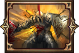
New UI Mockup
|
looks great
|

|
|
hmm is this being saved for final release? it is so detailed on that screenie..
If GGG chickens made an action RPG, what would it be called? Path of Eggxile, a Peck 'n' Slash RPG.
Why was the helmet spluttering? It was a coif. |
|
|
That screenshot is a high-quality artist's "mock-up" of the current UI. This has now been in the game for several months (note that Chris posted this thread in August, right after the beta started).
As a comparison, here's what the old UI looked like. Closed Beta/Alpha Tester back after a 10-year hiatus.
First in the credits! |

|
|
It looks better for sure, the 3 major difference I notice was:
1.HP/MP sphere have a more rich effect but I would like to see shield effect also did anything change about that? 2.The item icons looks better/more detailed especially the flasks. 3.Items dont have anymore background color (blue/red) to show how many blocks occupy inside inventory. I think that's the major changes about UI did I miss anything? Last edited by rpgmaniac#3062 on May 1, 2012, 11:21:49 AM
|

|
|
I'm digging this. The color scheme is nicely unified, it's easy to read and it doesn't take too much space.
|

|
|
I don't believe this "new UI" is relevant anymore; it's an earlier version of what we have now as far as I can tell. This thread was bumped after about a year of no posts.
|

|


