
In The Fall of Oriath, we're improving Path of Exile's minimap to make it easier to navigate through complicated areas. Today's post includes a preview of the map and a little bit of insight into how the new map was made. This weekend we're also running a Super Stash Sale where we're discounting all stash tabs!
While updating the minimap we had three main goals:
Areas like The Docks have always been particularly hard to navigate because many of the obstacles were not rendered on the minimap due to technical limitations. To address this issue across the board, we have added a walkability layer to the minimap that precisely indicates which areas can and can't be traversed (click on the images below to see the full screenshots).
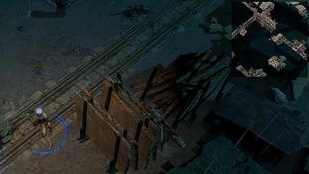 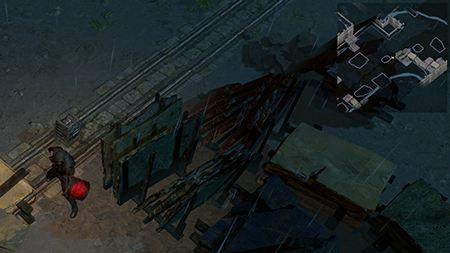
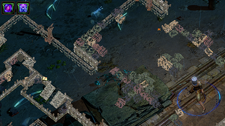 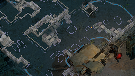
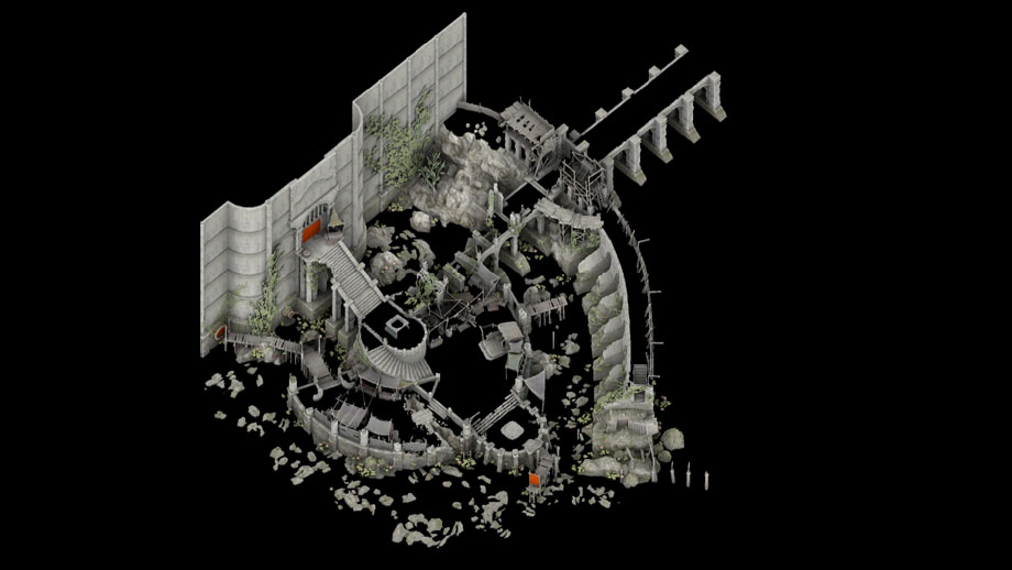
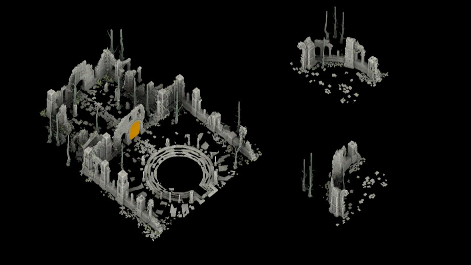
This layer is optional and can be turned off if preferred. However, it did prove to be very useful for navigating certain areas. We've also added an exploration line that shows walkable areas that are yet unexplored. When exploring the map, your character "pushes" this line until it disappears, indicating that the area has been completely explored. This feature creates a significantly improved experience while completing full map-clears or finding specific locations like quest points. We would like to note that in this video, the doorway colours are dim, but will be bright again for visibility once we're finished. An issue with the current minimap is that its depiction of terrain and obstacles isn't very clear. To improve this, we've taken advantage of the fact that the minimap is pre-rendered as a 2D set of tiles during the process of building the game. This means that we can significantly improve their quality without affecting performance in any way. The result is that we are able to apply high-quality ambient occlusion shading with supersampled antialiasing to make the tile geometry significantly more readable. To share some insight into this process, here are some example shots of the tiles being used to render the minimaps. 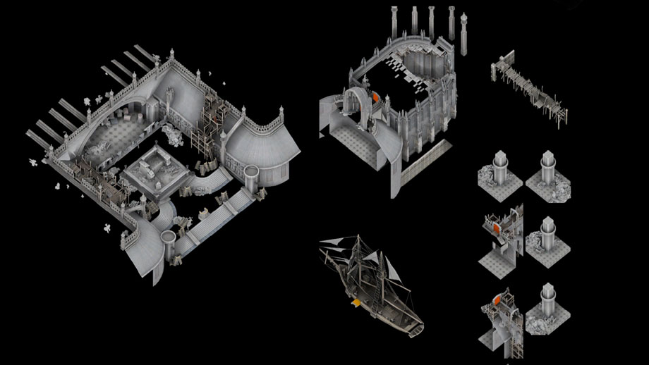
You'll be able to explore the new features of the minimap in the Fall of Oriath Beta! Click here for more information on how you'll be able to join. Super Stash Sale!This weekend, we're holding a Super Stash Sale where we're discounting every type of stash tab. Everything has been discounted, from Premium Stash Tab Bundles, Premium Quad Stash Tabs, Currency Tabs and even Guild Stash Tabs! Click here to view the full selection of discounted stash tabs.Don't forget to grab your Legacy Supporter Packs, Legacy Hat and Classic Mystery Box! Thank you so much for your support! |
|||
|
NICE ONE!
waited for this! edit: First time First :)) 24.1.2018 [quote="Dro28"]wheres my fragment tab?[/quote] (I thought that was a joke) 25.1.2018: GGG- Introducing the Fragment Stash Tab! Last edited by unlucky_child#3397 on May 12, 2017, 12:10:16 AM
|
| ||
|
f a n c y
|
| ||
|
Yes, minimap!
BTW, can you change the opacity of the minimap? Last edited by yazzlecat#6066 on May 12, 2017, 12:11:00 AM
|
| ||
|
Awesome!
|
| ||
|
Looks great :D!
|
| ||
|
nice
|
| ||
|
about time :O
Harvest sucks! But look at my decked out gear two weeks in!
Labyrinth salt farm miner. "But my build diversity" , "Game is too hard!" - Meta drone playing the same 1-3 builds for years. |
| ||
|
That looks slick!
|
| ||
|
HELL YEAH
|
| ||


